Jenn Hicks Wordmark
The modern home for online board games.
Brand Identity
UI/UX
Advertising
The challenge
Digital board game platforms had proven demand, but the category felt visually dated and lacking in personality.

Merchants of Play had a clear product edge: a proprietary 3D engine that could bring games online in days instead of months. The platform needed to feel distinctive, modern, and be flexible enough to take centre stage (or the backseat) when needed.
The solution
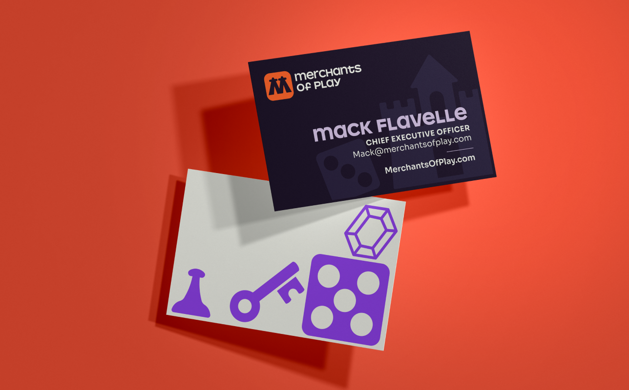
The identity's monogram was shaped around two meeples. a simple symbol of what board games do best — bring people together through play.
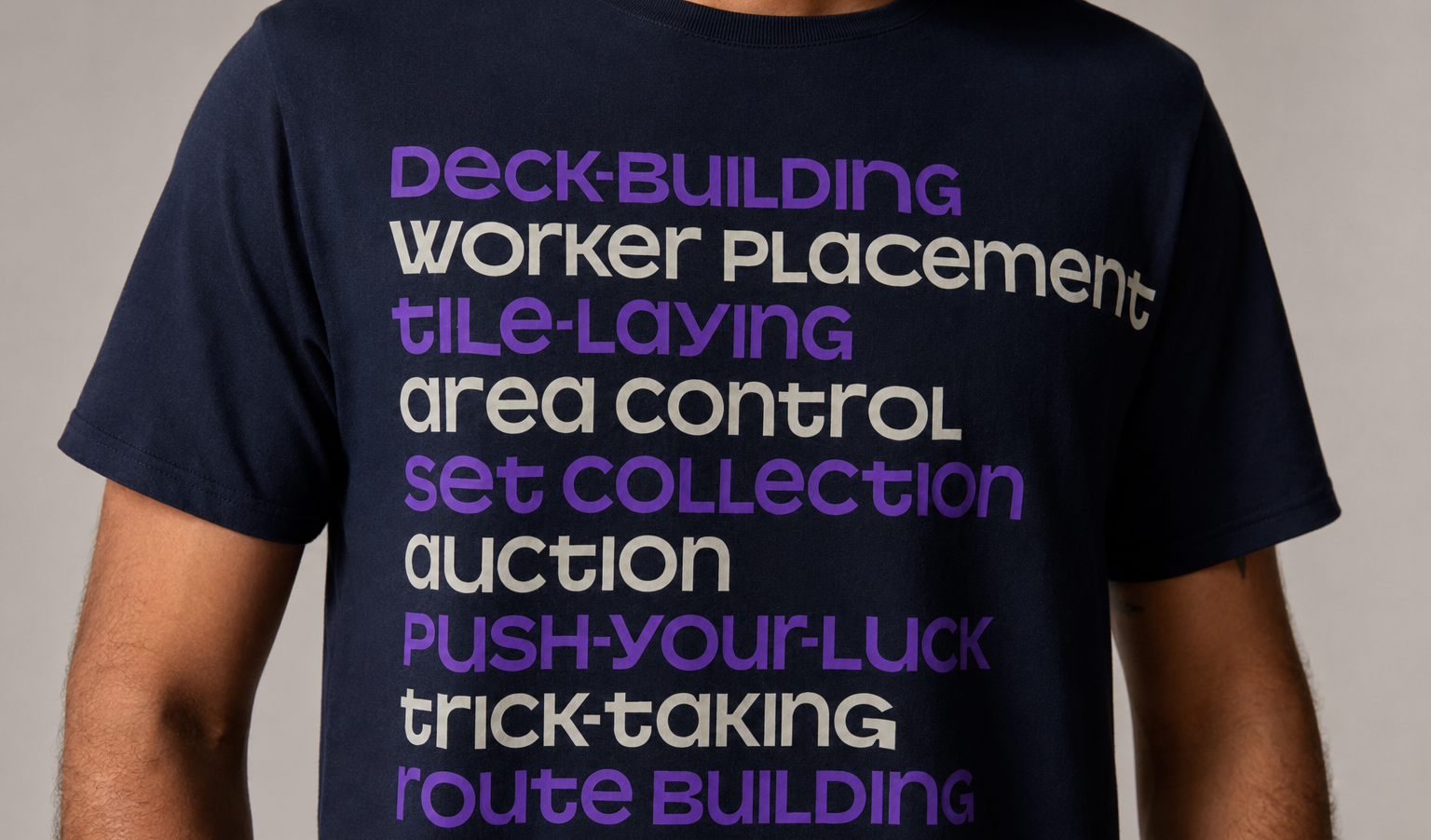
A tshirt with MoP branding
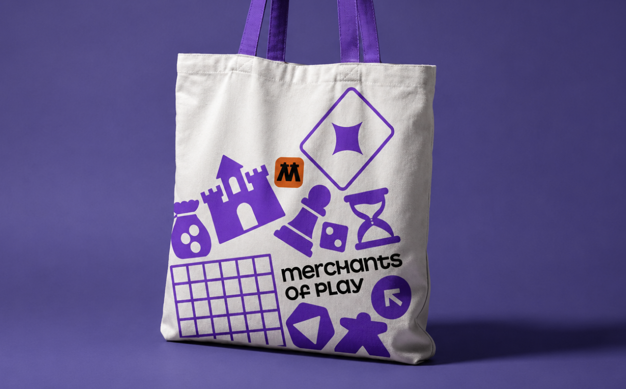
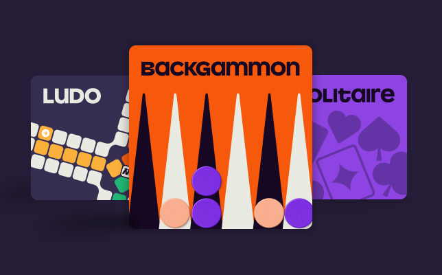
The visual language was inspired by tabletop game components and their actions – dice, tokens, cards; tumbling, scattering, flipping. A dark-mode colour palette punctuated with orange and purple felt modern and distinct, while the typeface pairing balanced functionality and personality.
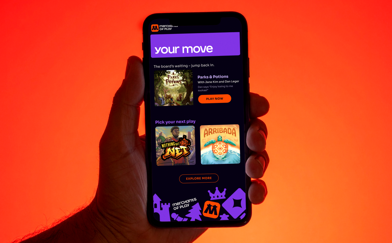
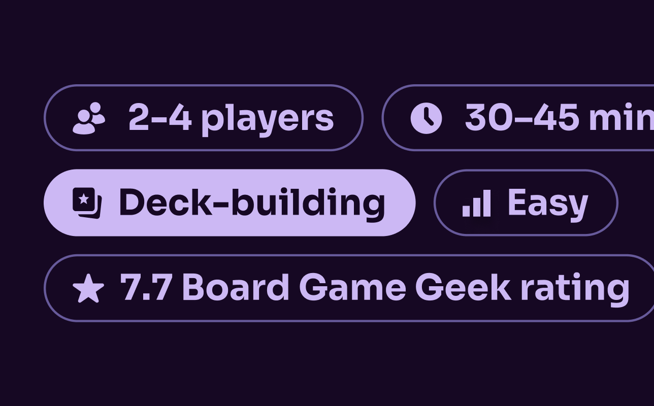
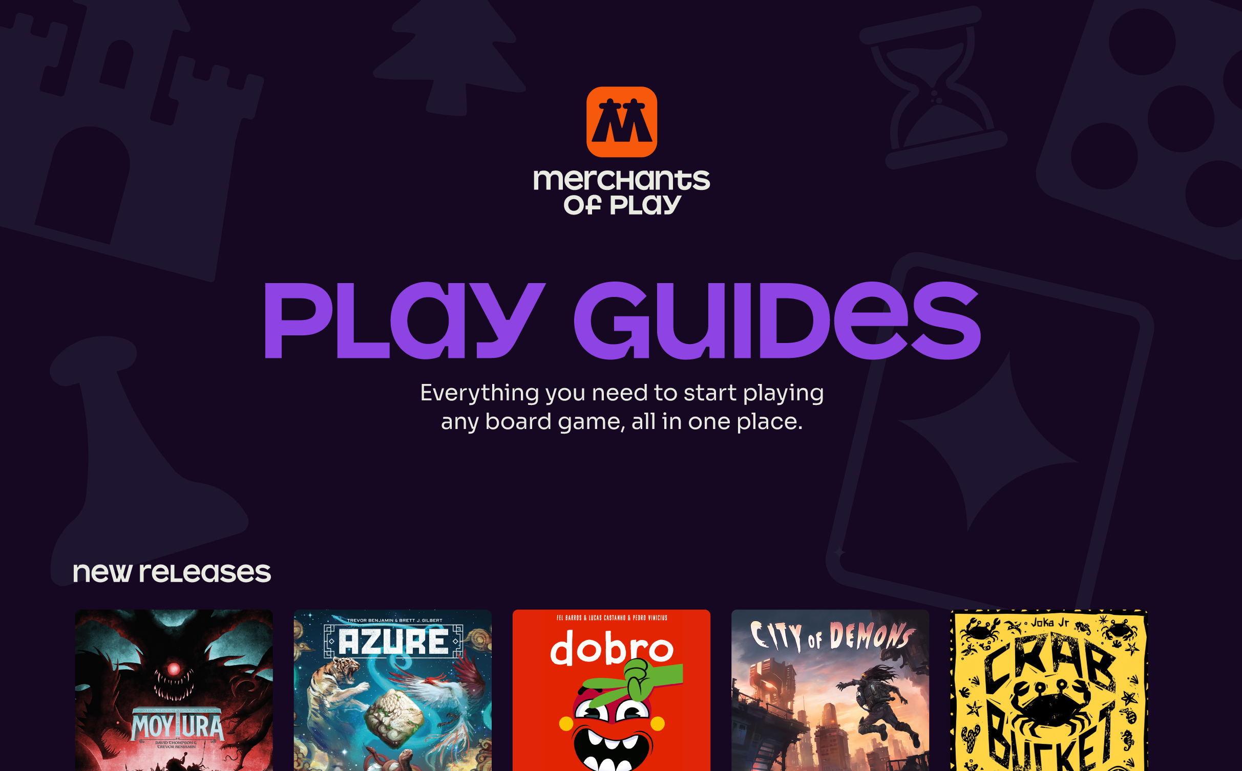
The UX guides players from discovery, to learning, to playing in one seamless experience. A modern, dark-mode colour palette inspired the UI and differentiated from the competition.
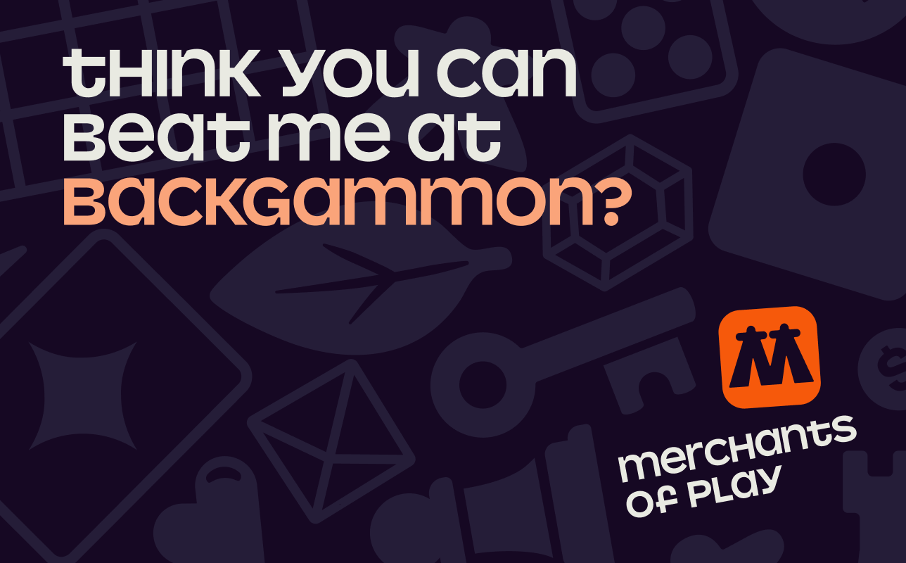
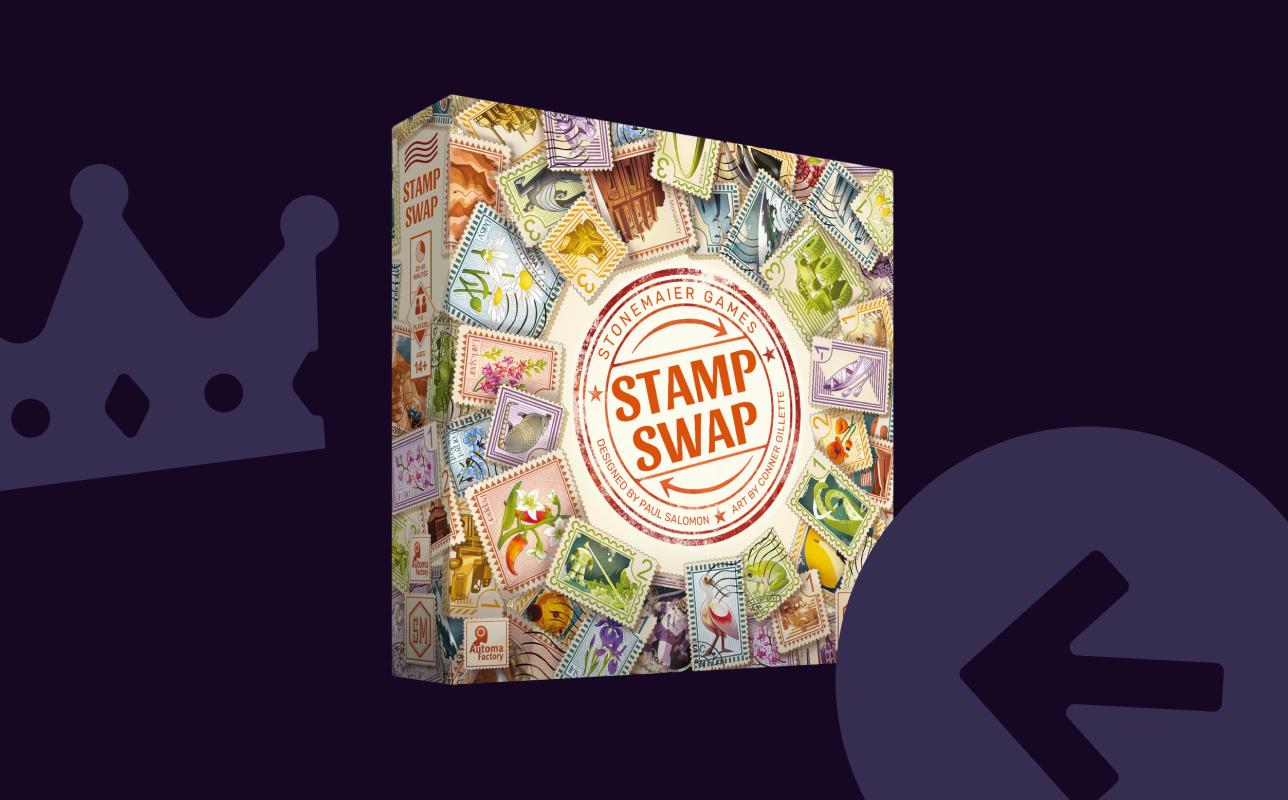
Advertising campaigns were segmented into two different audiences — players and publishers. Game creators were targeted in the crowdfunding page to encourage development of a digital version of their game, affording the platform with the most cutting edge content. 
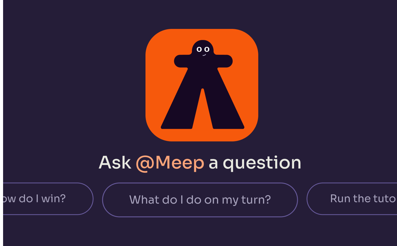
Learning board games can feel intimidating, so friction was removed as much as possible. Resources dedicated to helping people learn rules, as well as an AI assistant, Meep, empowered players to learn at their own pace. Meep goes beyond the typical AI chat box, with the ability to both follow your cursor or guide you to elements on the board.

Created while working at Merchants of Play
More projects
Want to create something together?
© 2026 Jenn Hicks. All rights reserved.