Jenn Hicks Wordmark
A West Coast classic, reimagined.
Brand Identity
Packaging
Advertising
The challenge
Despite the name, Stanley Park Brewing’s previous brand had little connection to the place that inspired it. To help the brewery become one of British Columbia’s most recognized craft beer brands, the new identity needed to reflect what Stanley Park is to Vancouverites — a symbol of our west coast desire to live a balanced life.
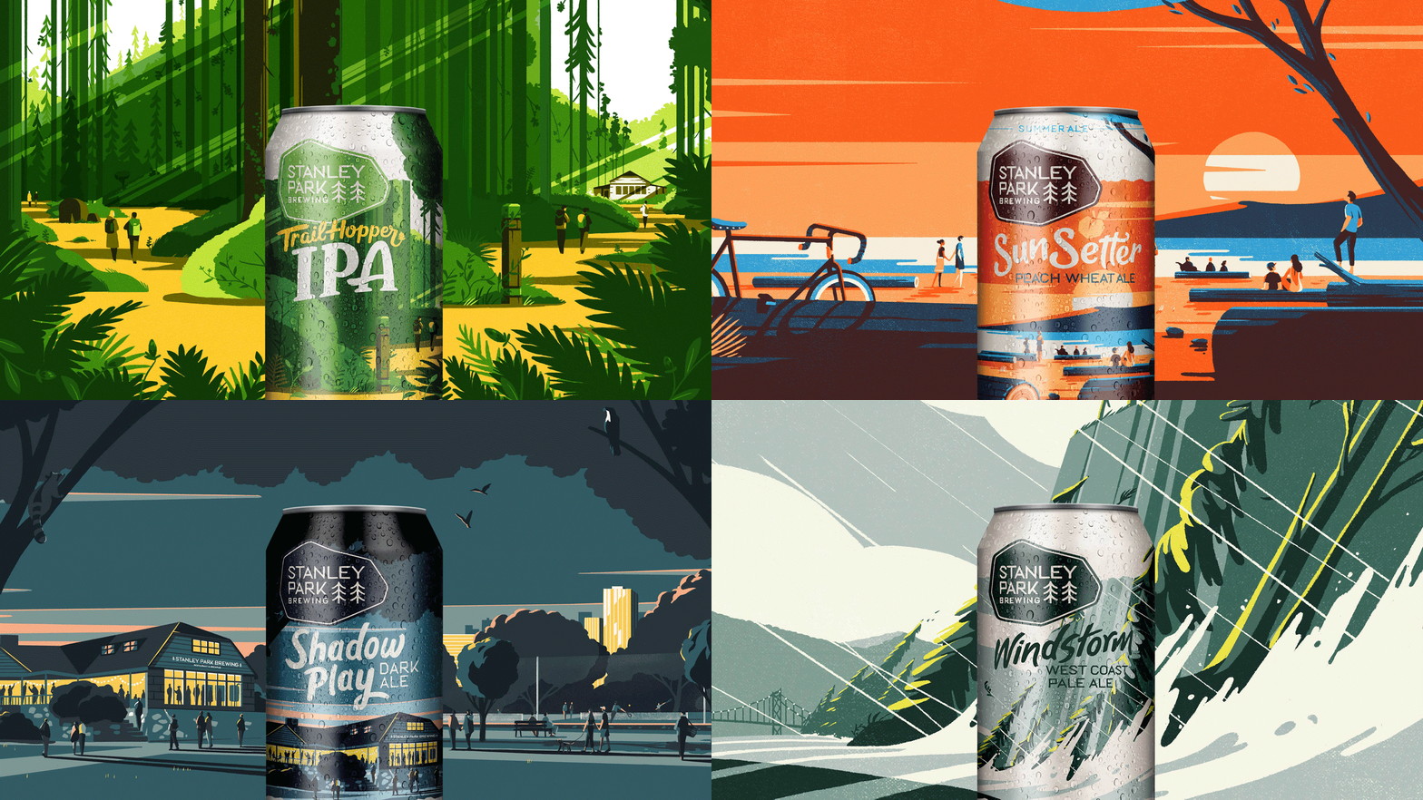
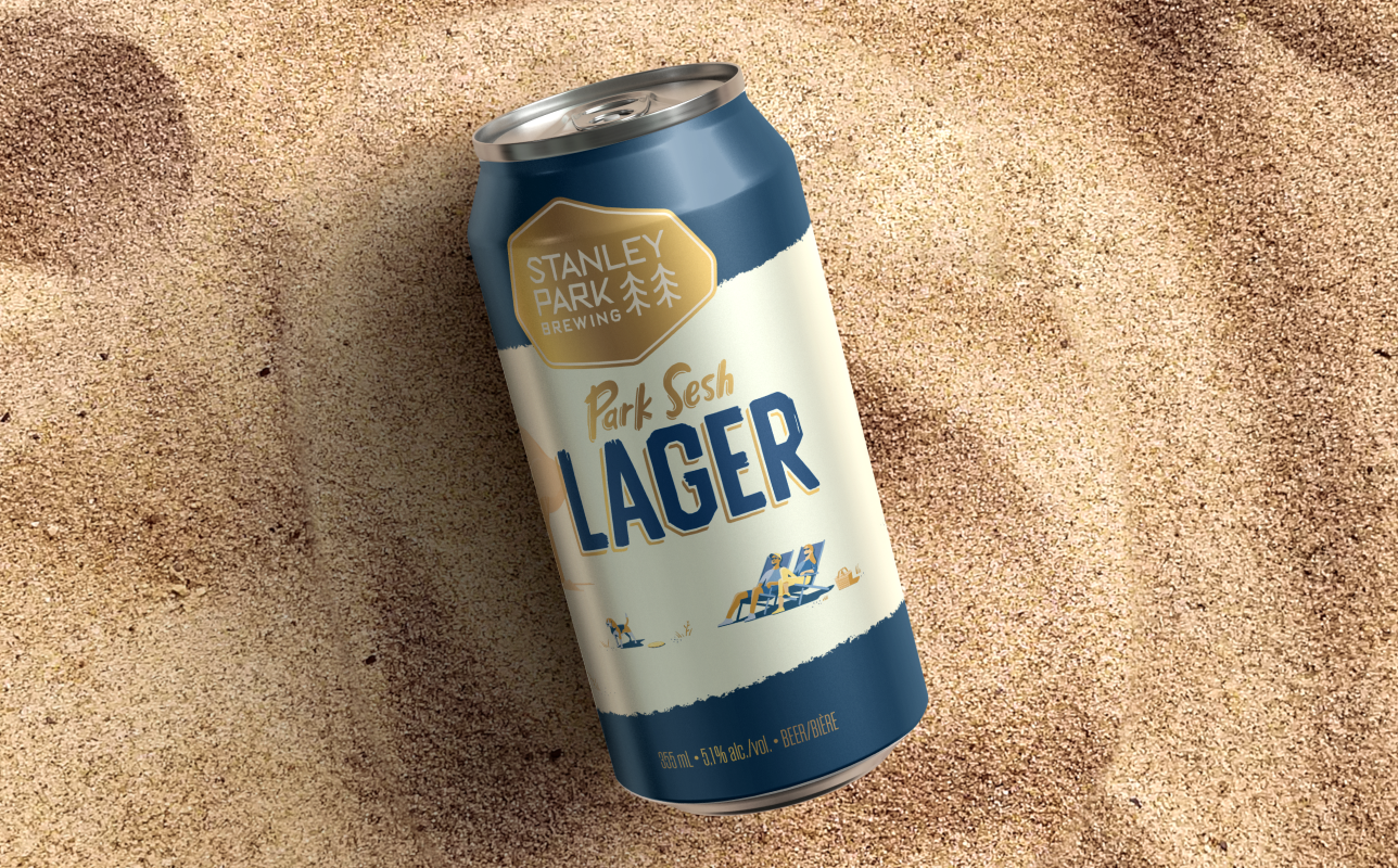
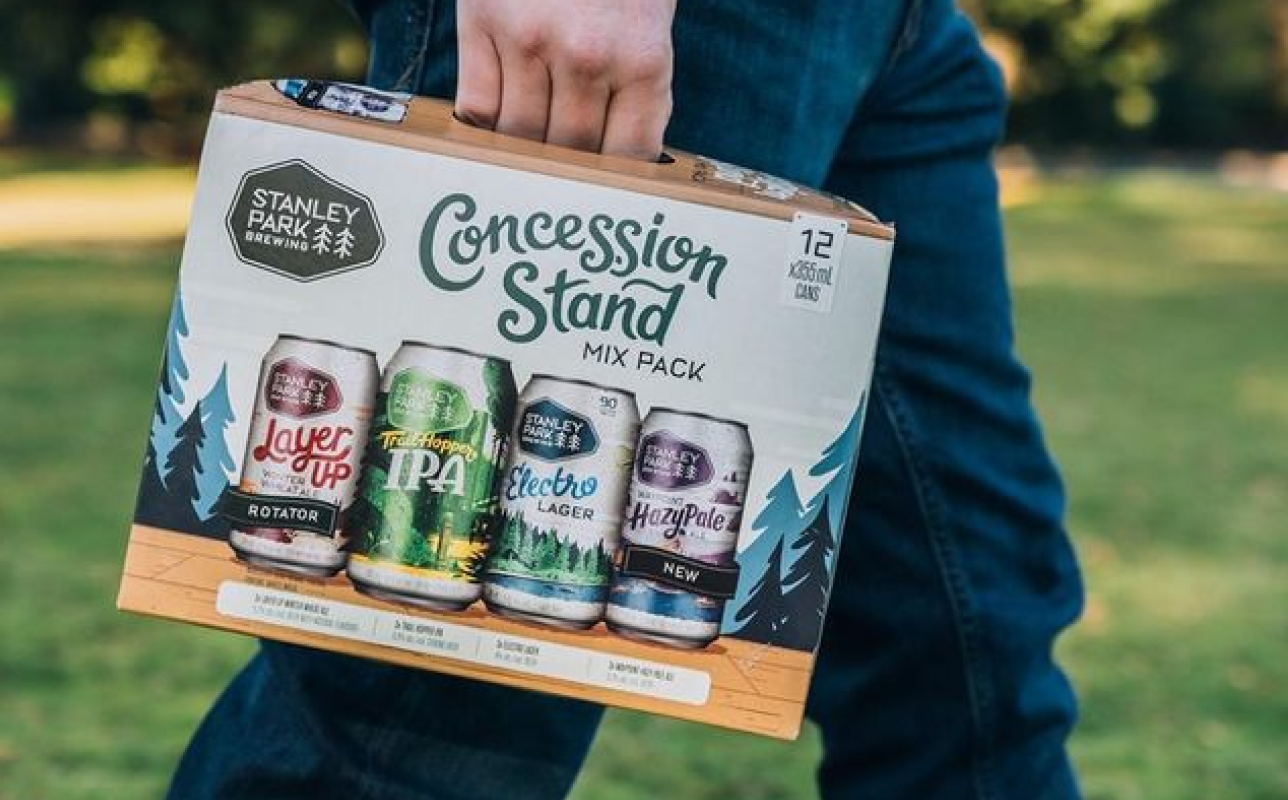
SPB various can packaging
The solution
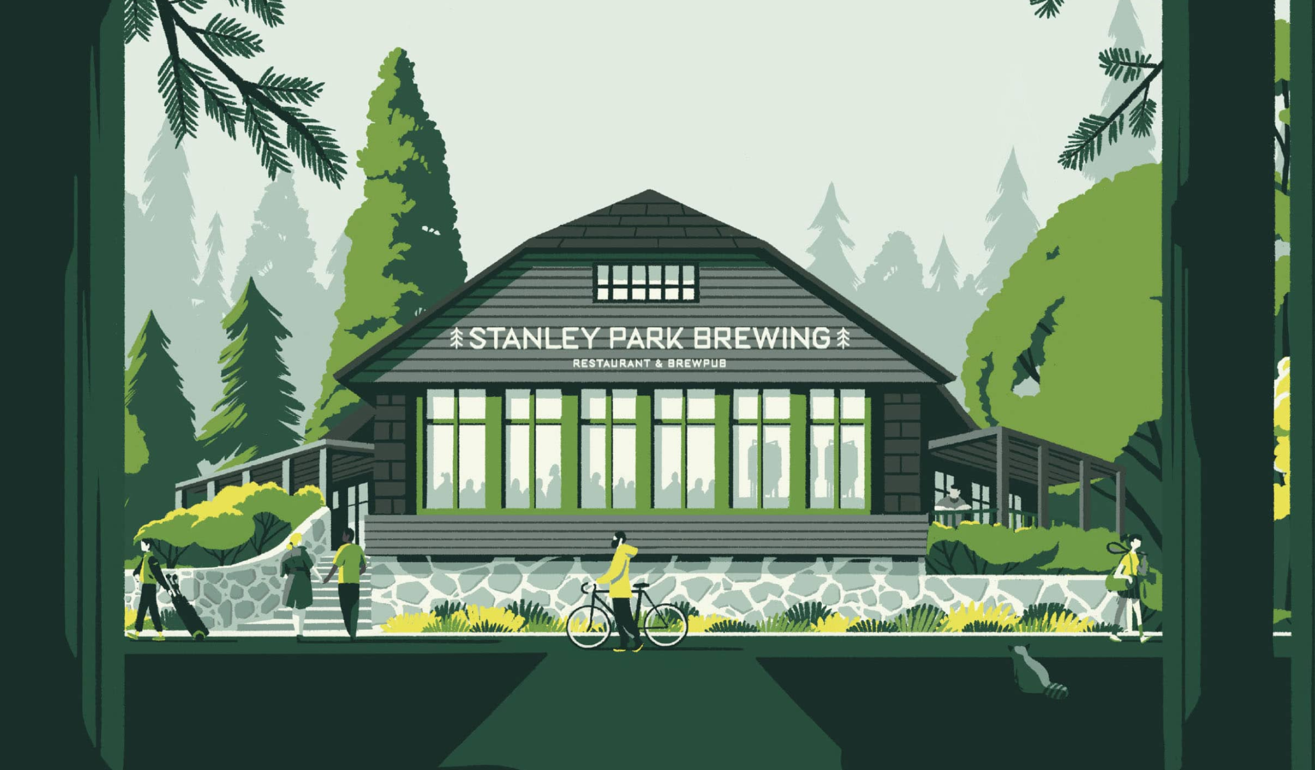
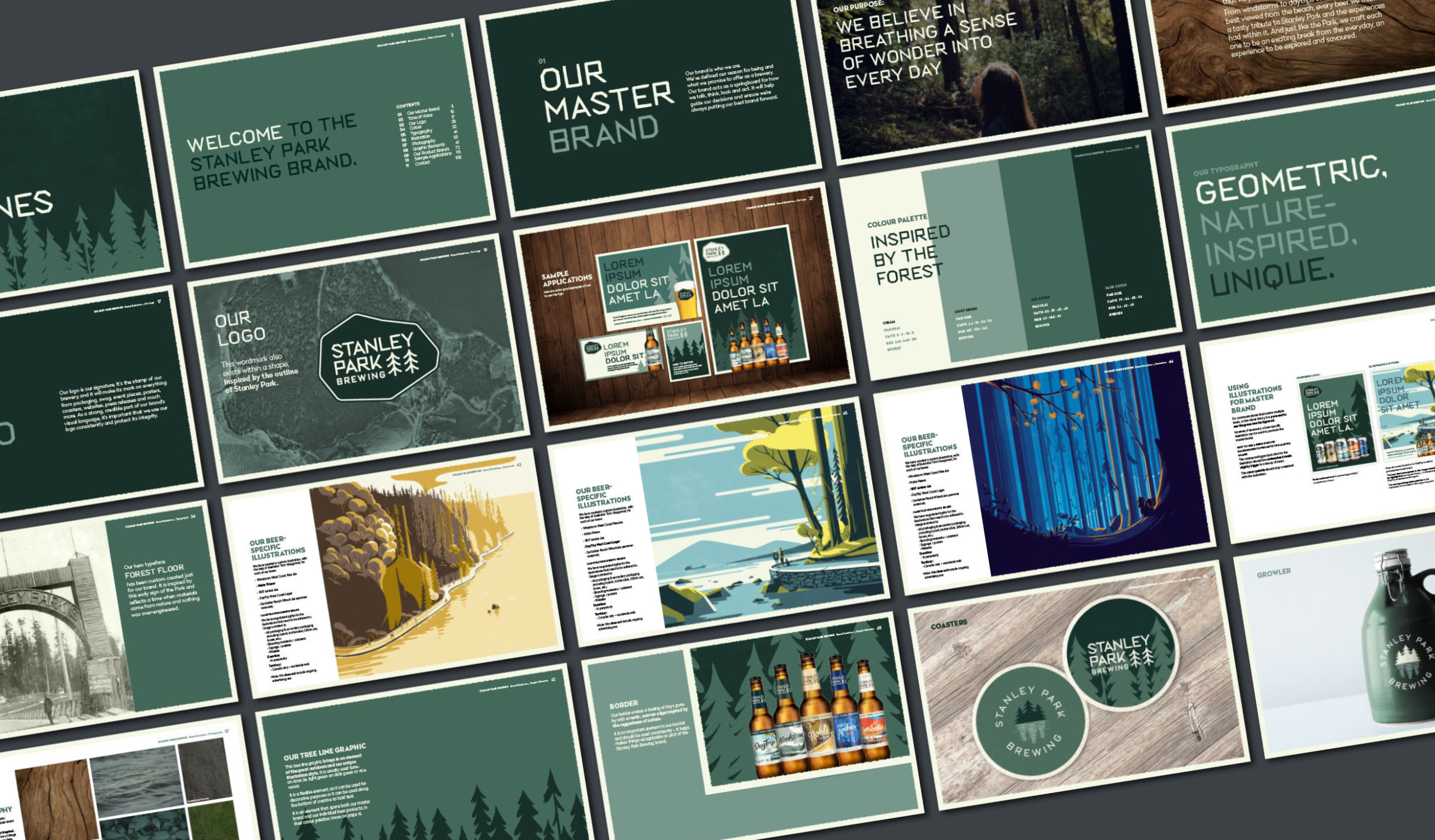
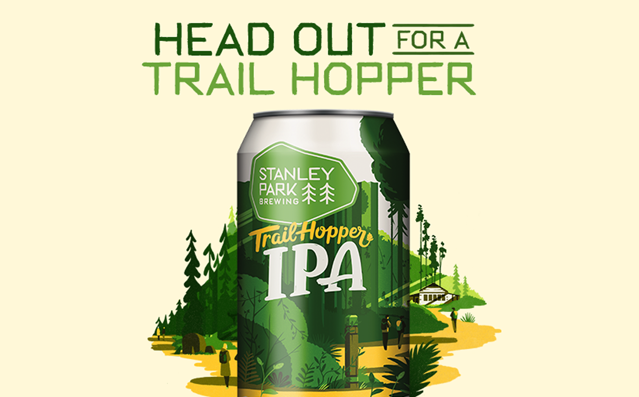
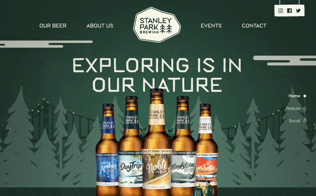
The new brand brought in a sense of place through illustrations by renowned artist Tom Haugomat, capturing different iconic locations or moments within the park.
A custom display typeface was created to give the brand an instantly recognizable unifying element. Its forms were inspired by a heritage photograph of the park’s former entrance — built entirely from sticks gathered from the forest floor.
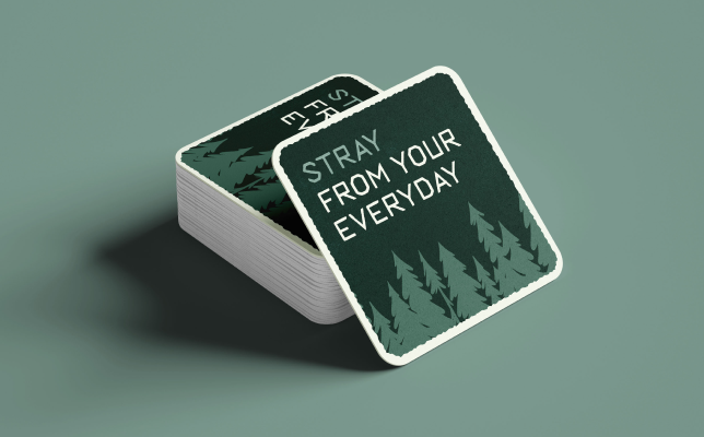
Stanley Park Brewing coastersStanley Park Brewing iconography
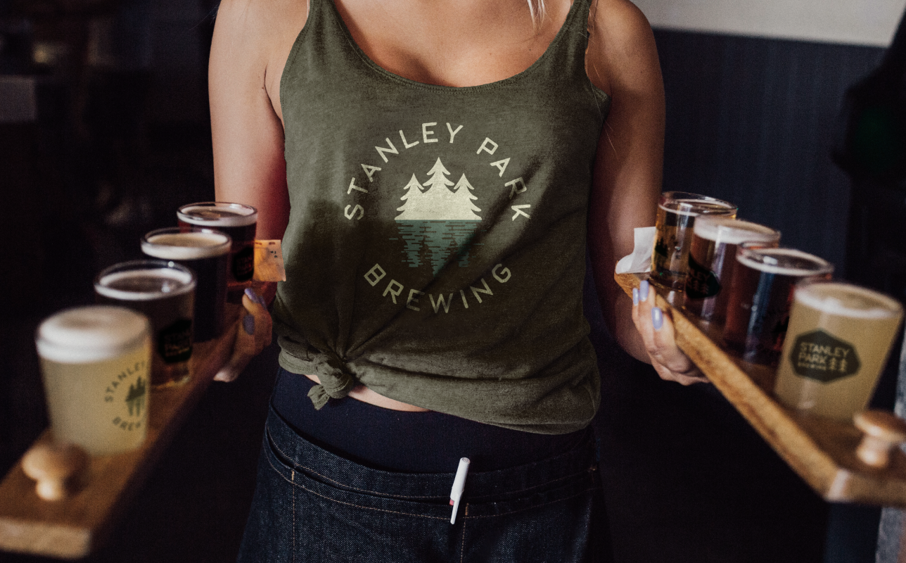
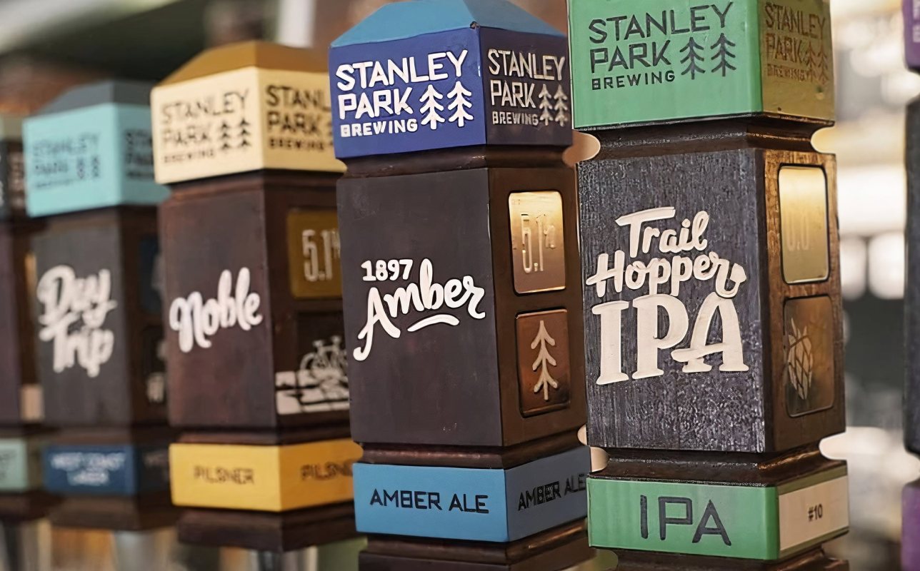
The identity system was designed to flex across a wide range of SKUs, allowing each product to stand apart while maintaining a unified look.

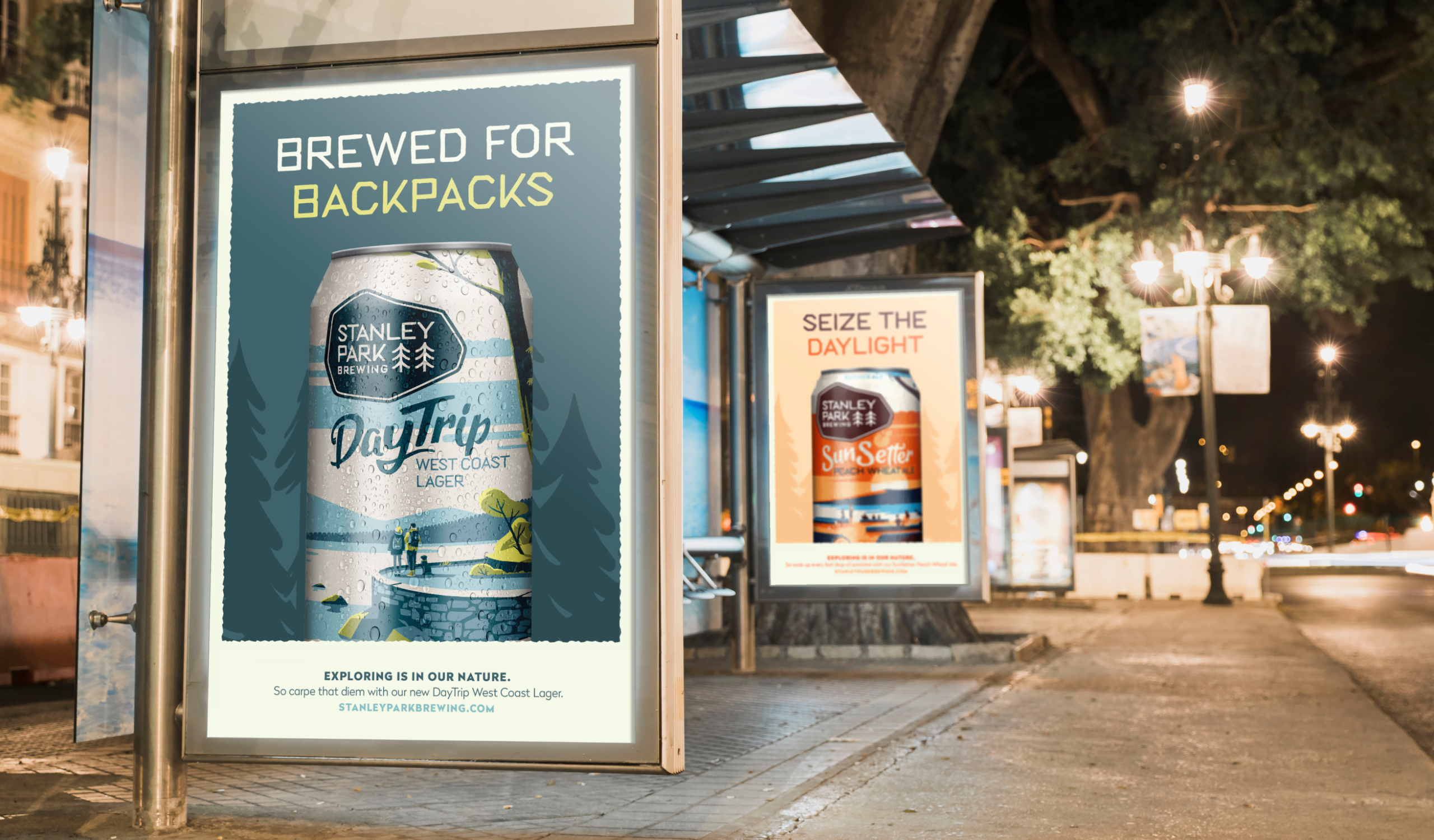
The rebrand launched with a campaign reintroducing Stanley Park Brewing as an approachable craft beer rooted in West Coast wonder, inviting people back to the park (and the brand).
Created while working at WILL
Creative Director: Nick Richards
Strategy & Brand Team: Nicola Poskitt
Designer & Art Director: Jenn HIcks
Copywriter: Katie Holmes
Illustration: Tom Haugomat
Website Art Direction: Antonio AR
More projects
Want to create something together?
© 2026 Jenn Hicks. All rights reserved.