Jenn Hicks Wordmark
Repositioning seaplane travel as a smart shortcut.
Brand Language
Advertising
The challenge
Harbour Air is North America's largest seaplane airline, connecting communities across coastal British Columbia. Despite its scale, it was best known for scenic flights and premium travel, but rarely considered a practical transportation option. The challenge was to refresh the brand and reposition seaplane travel as a smart way to move along the coast.
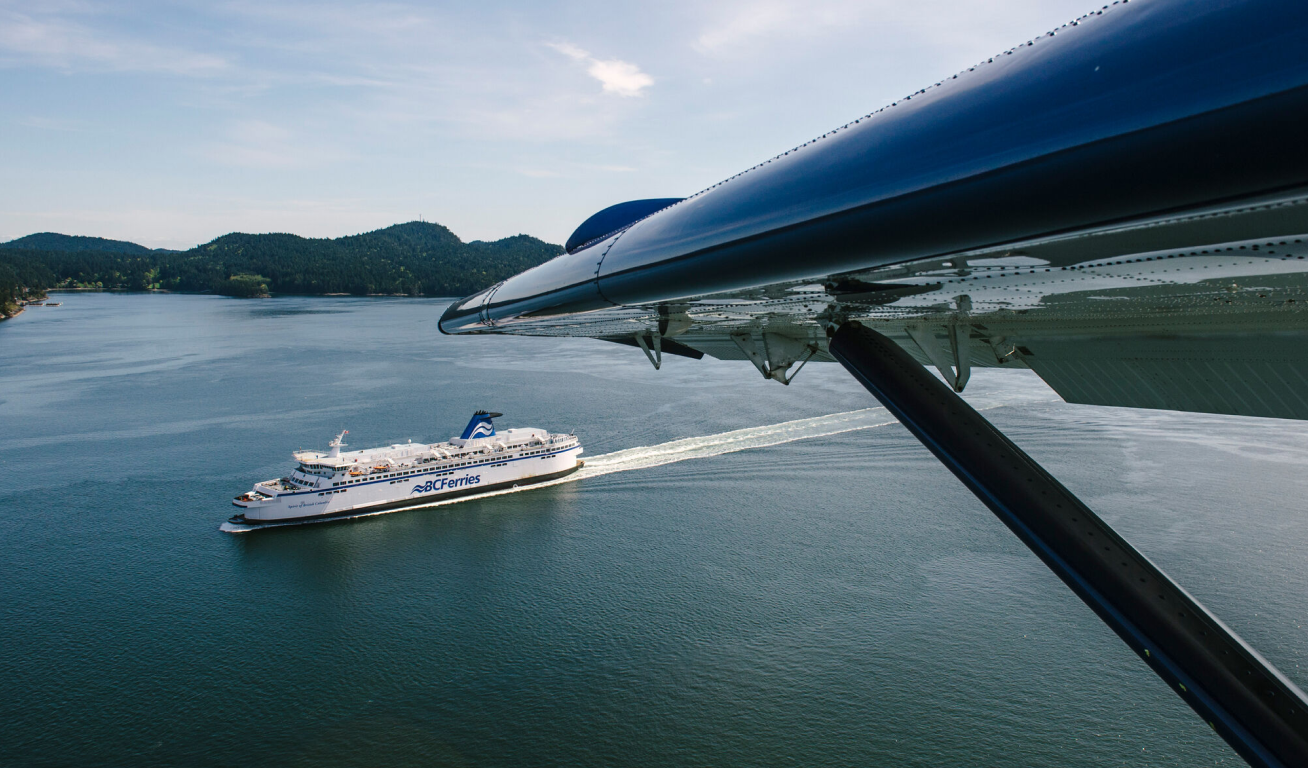
View of a BC ferry from a Harbour Air plane
The solution
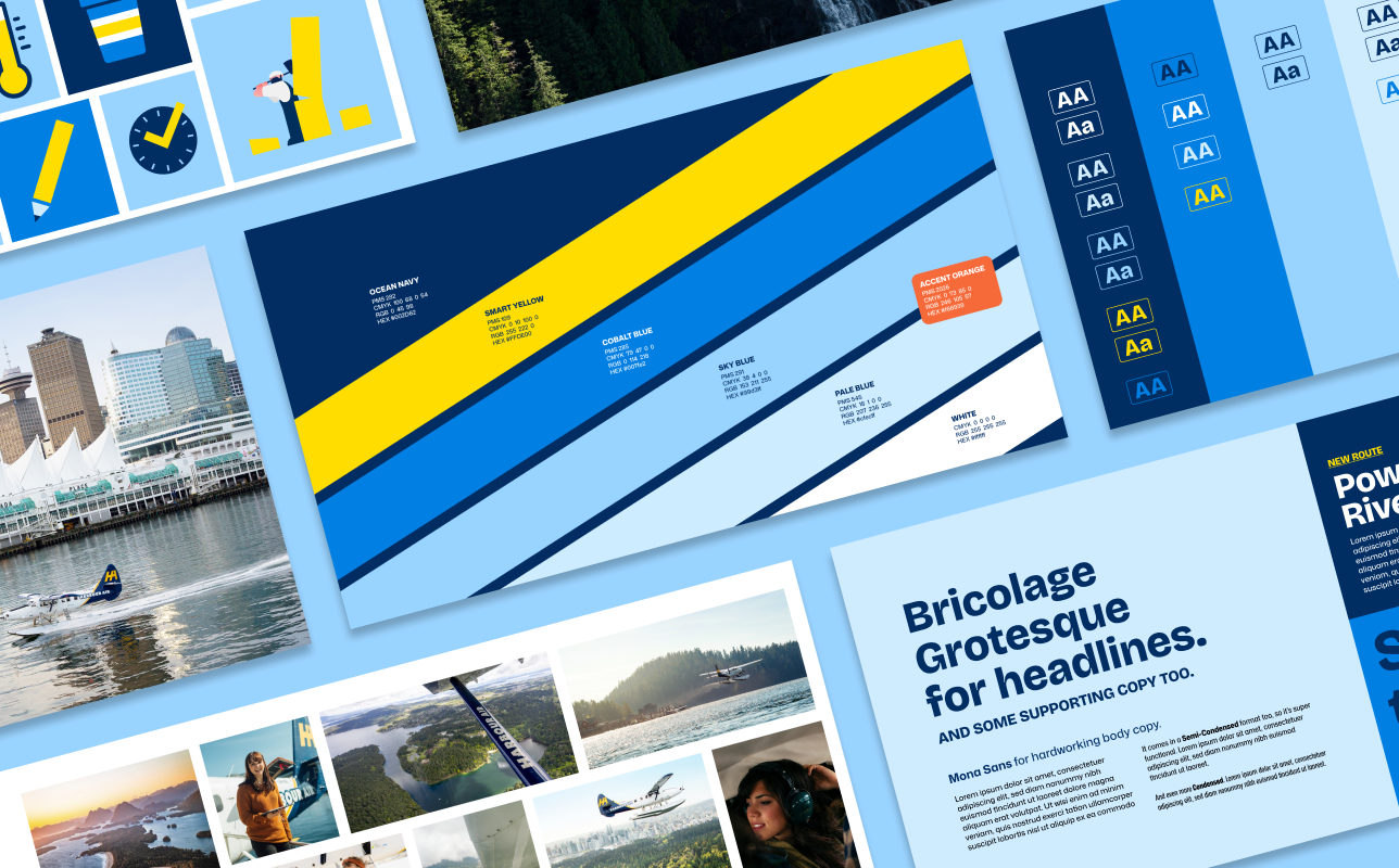
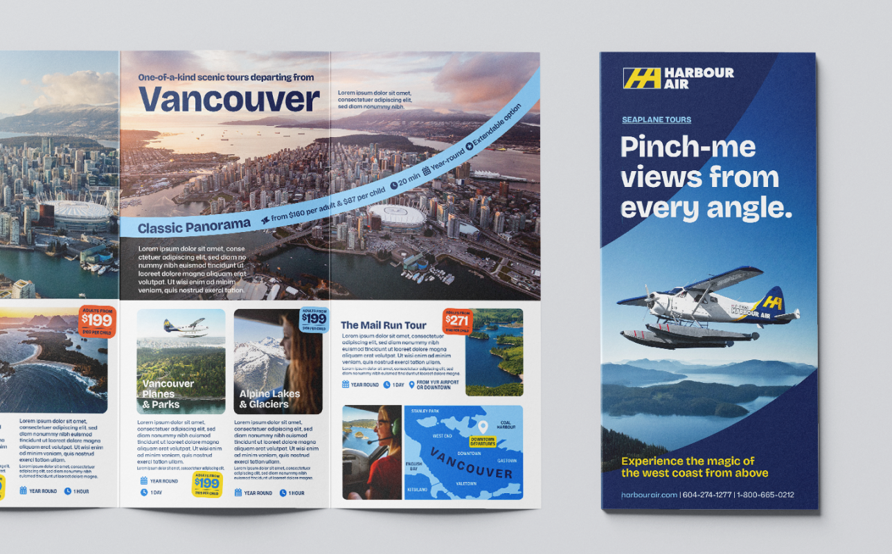
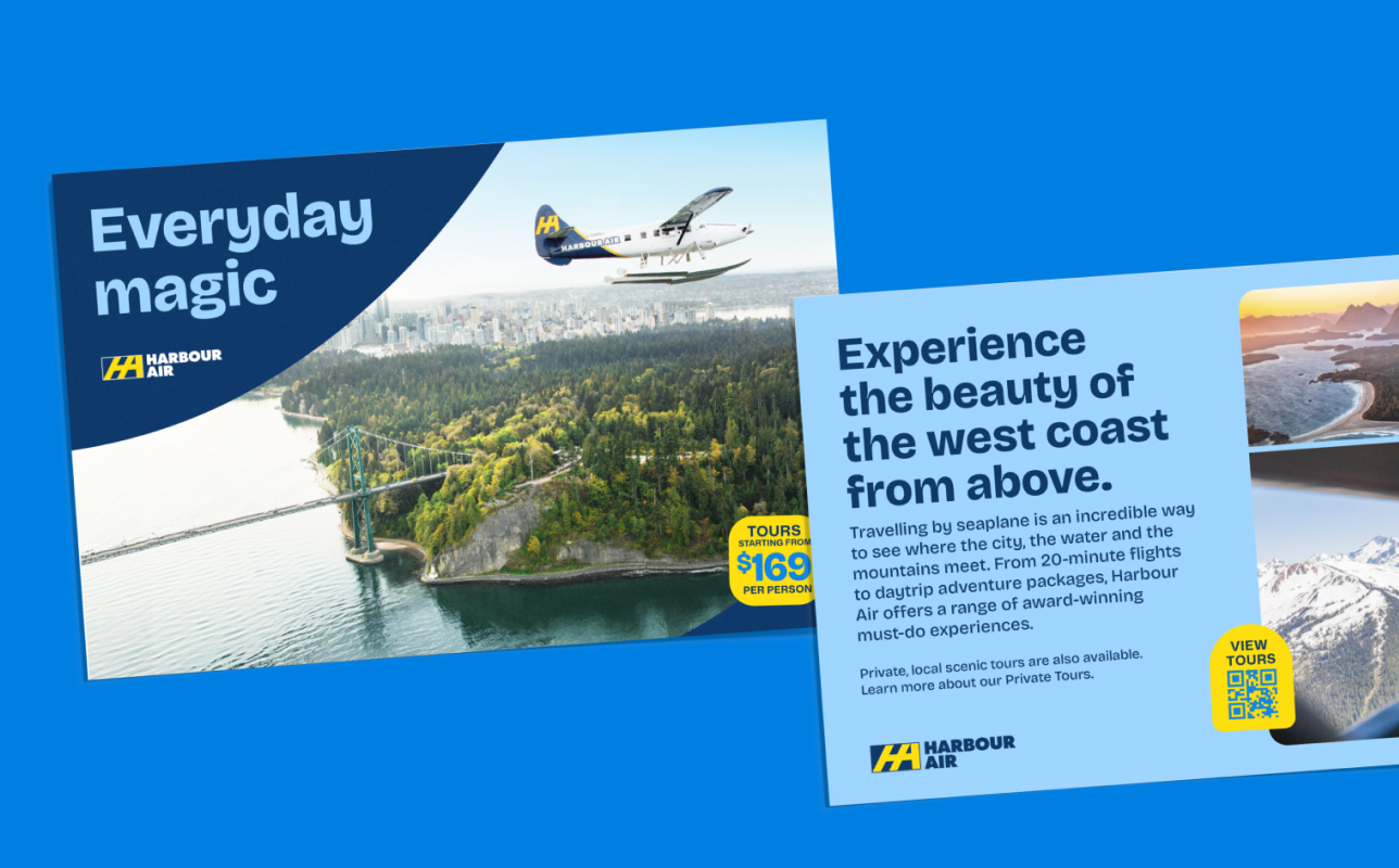
A defined visual language of colour, typography, and illustration created a cohesive foundation for the refreshed brand.
A yellow 'Smart' line extracted from the logo became a key graphic device, symbolizing the simplicity of flying Harbour Air. The device cleverly integrates into illustrations, creating a flexible brand asset that brings plenty of charm.
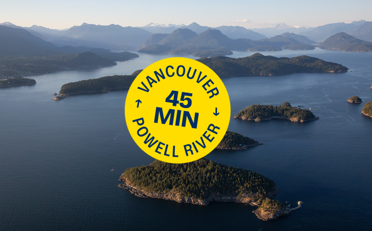
A curved line inspired by a flight arc brings dynamism to layouts, while a flexible sticker system adds tactical messaging across communications.
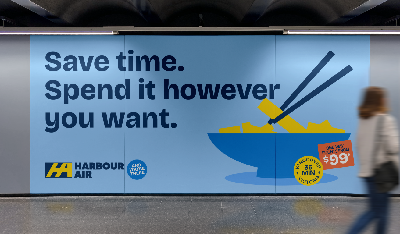
Harbour Air billboard
A smart, confident tone gives the brand more personality while reflecting the warmth and friendliness of the Harbour Air experience.
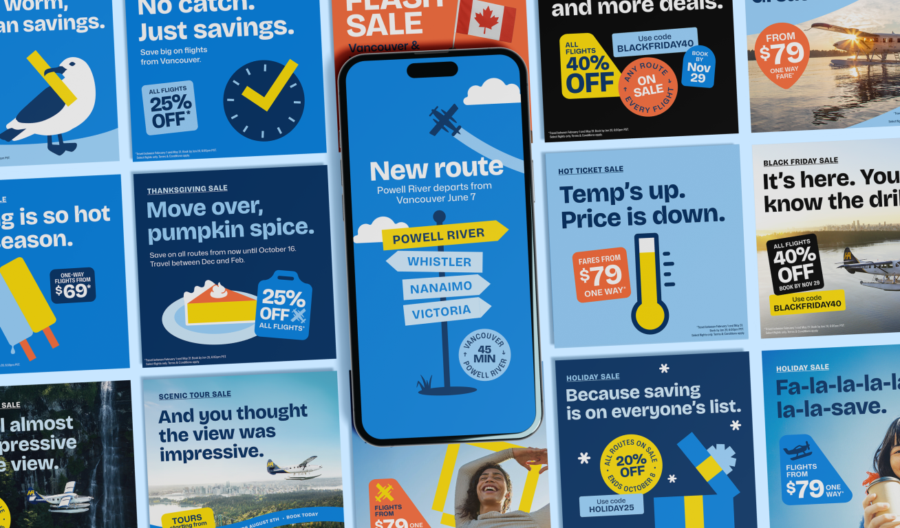
A campaign toolkit with a calendar of on-brand messaging and visuals supports ongoing promotions and seasonal campaigns, balancing variation with a consistent brand presence.
Harbour Air seasonal tactical ads
Harbour Air seasonal tactical posters
Created while working at WILL
Creative Director: Nick Richards
Strategist: Nicola Poskitt & Greg Frame
Designer & Art Director: Jenn HIcks
Copywriter: Danielle Haythorne
Brand team: Robin Hall
More projects
Want to create something together?
© 2026 Jenn Hicks. All rights reserved.