Jenn Hicks Wordmark
Reinvigorating a national identity.
Brand Language
The challenge
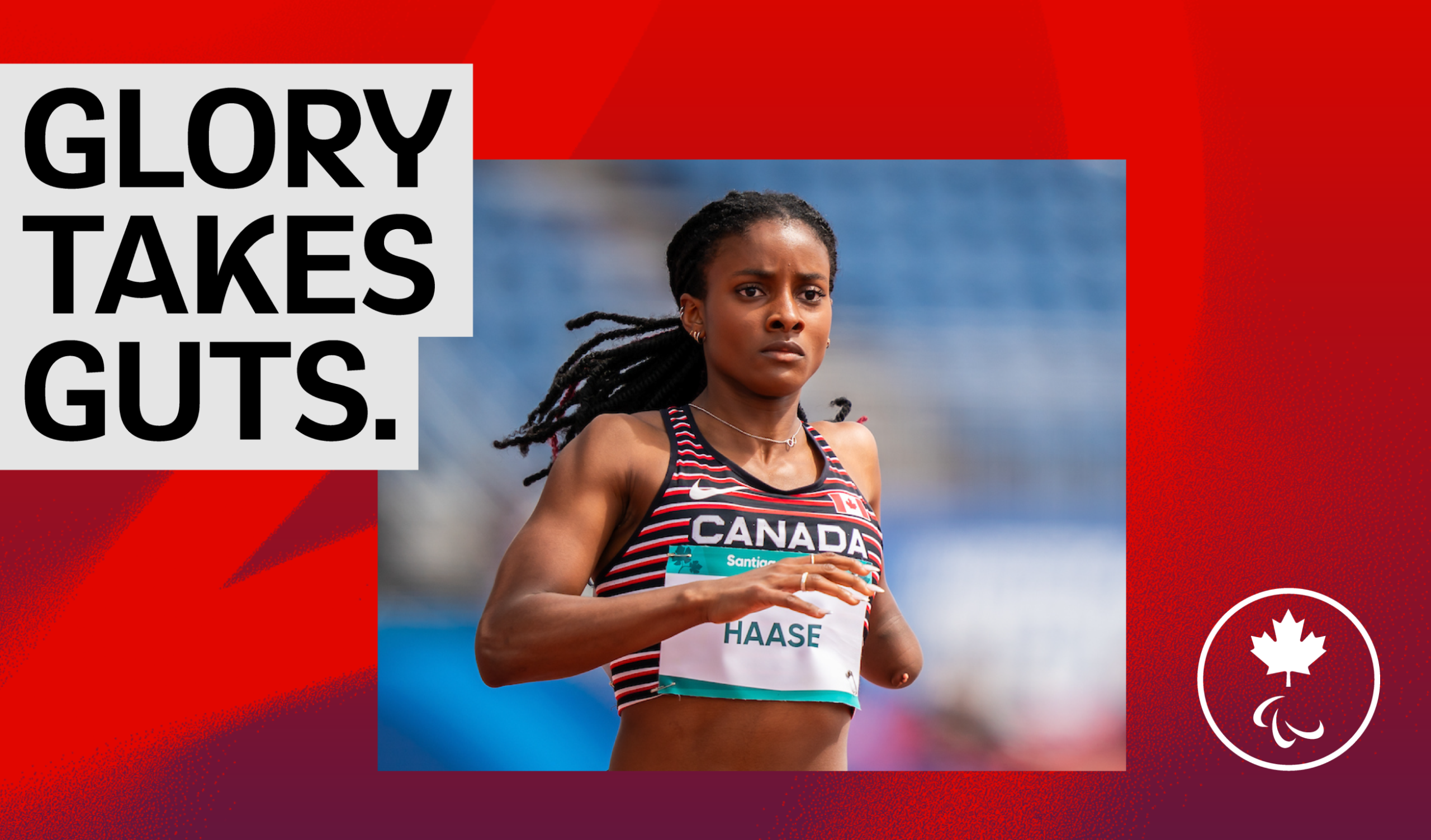
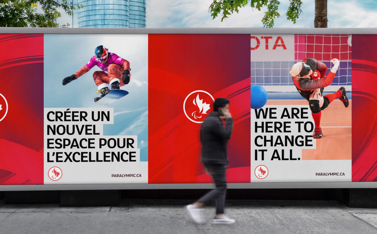
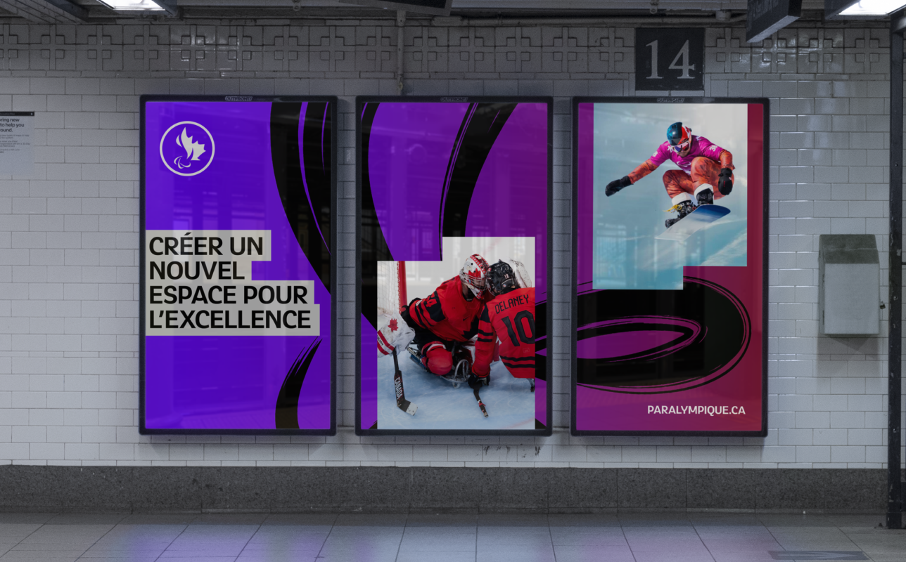
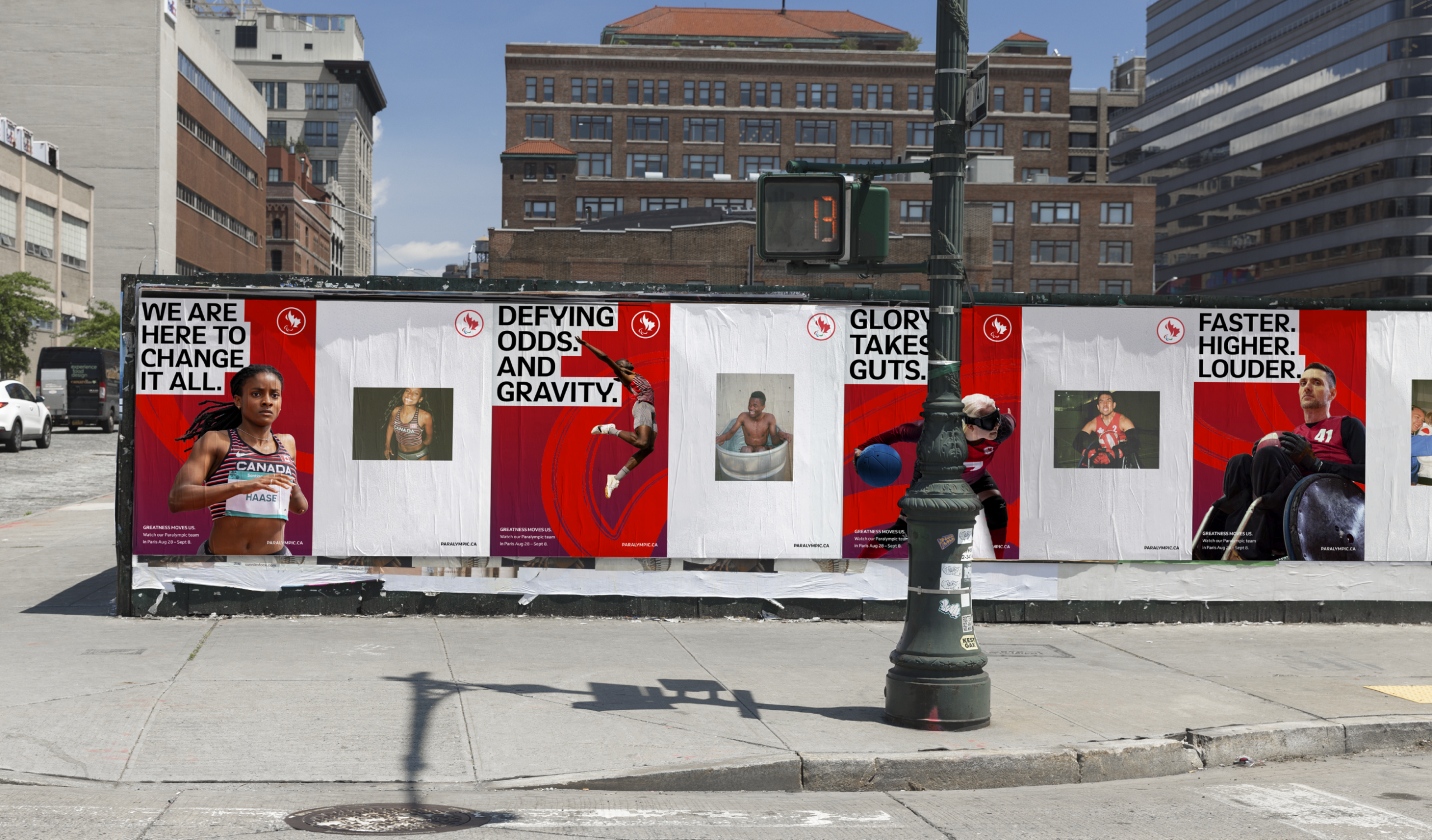
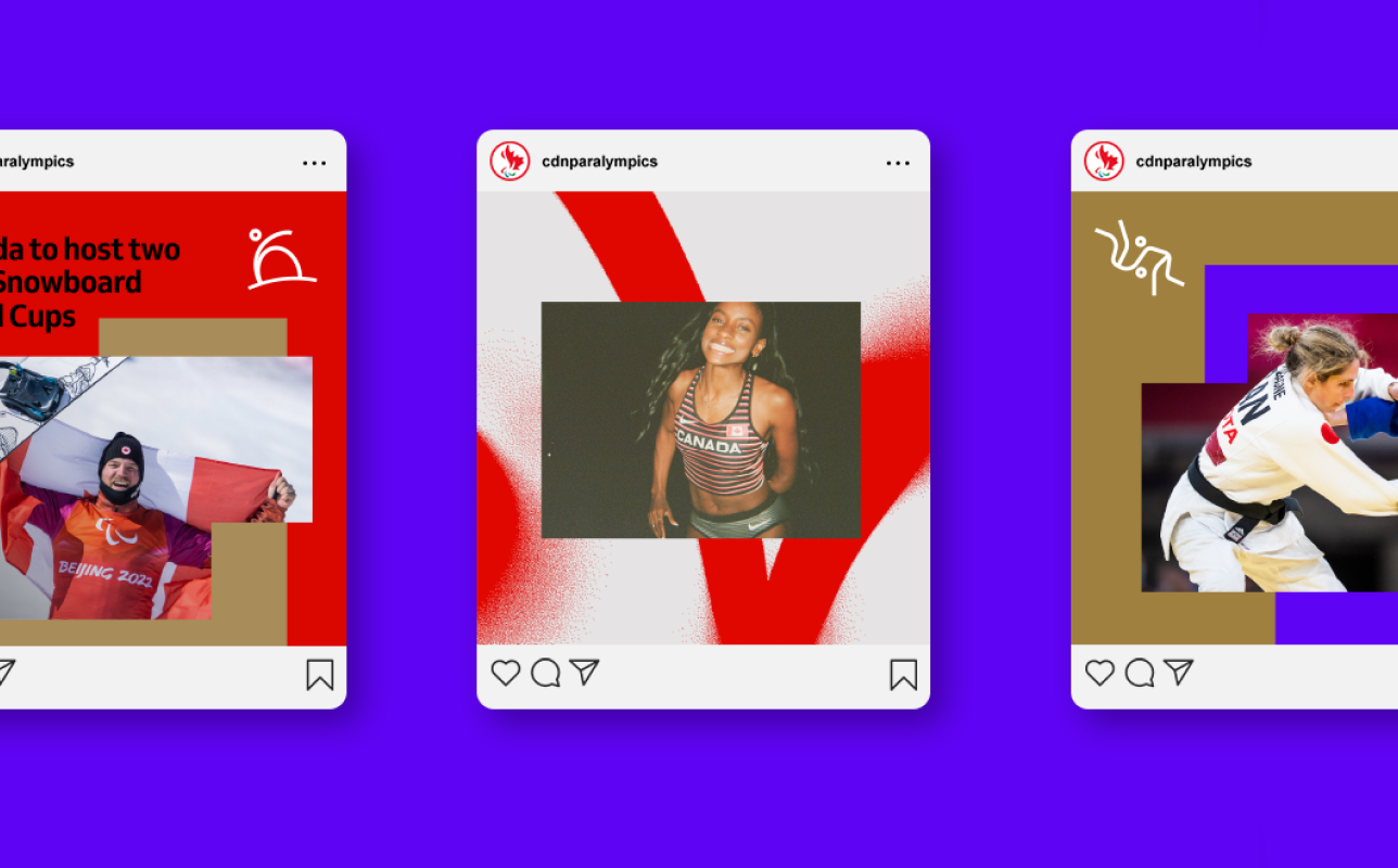
The Canadian Paralympic Committee needed a modernized identity ahead of the Paris Games — one that better reflected the energy, excellence, and diversity of Paralympic sport. The challenge was to create something visually distinctive and emotionally powerful, while making accessibility a non-negotiable foundation of the brand.
The solution
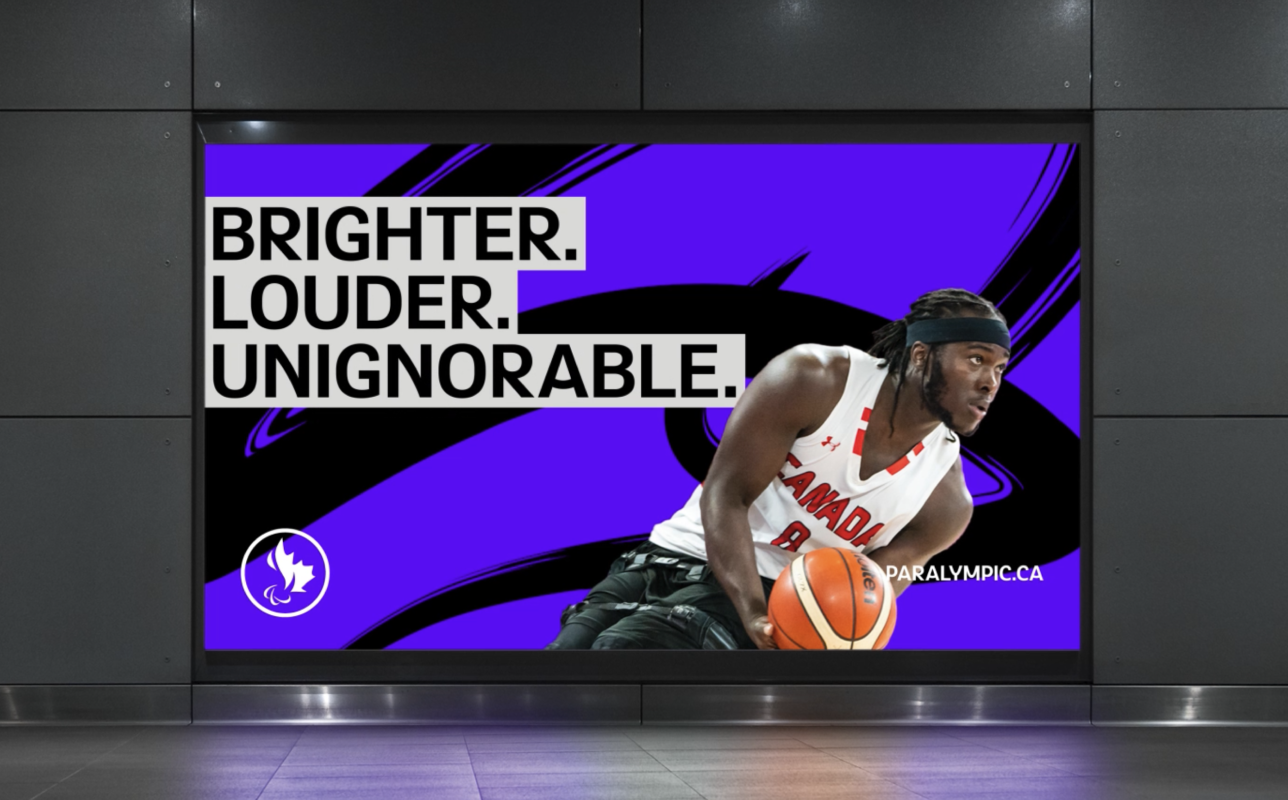
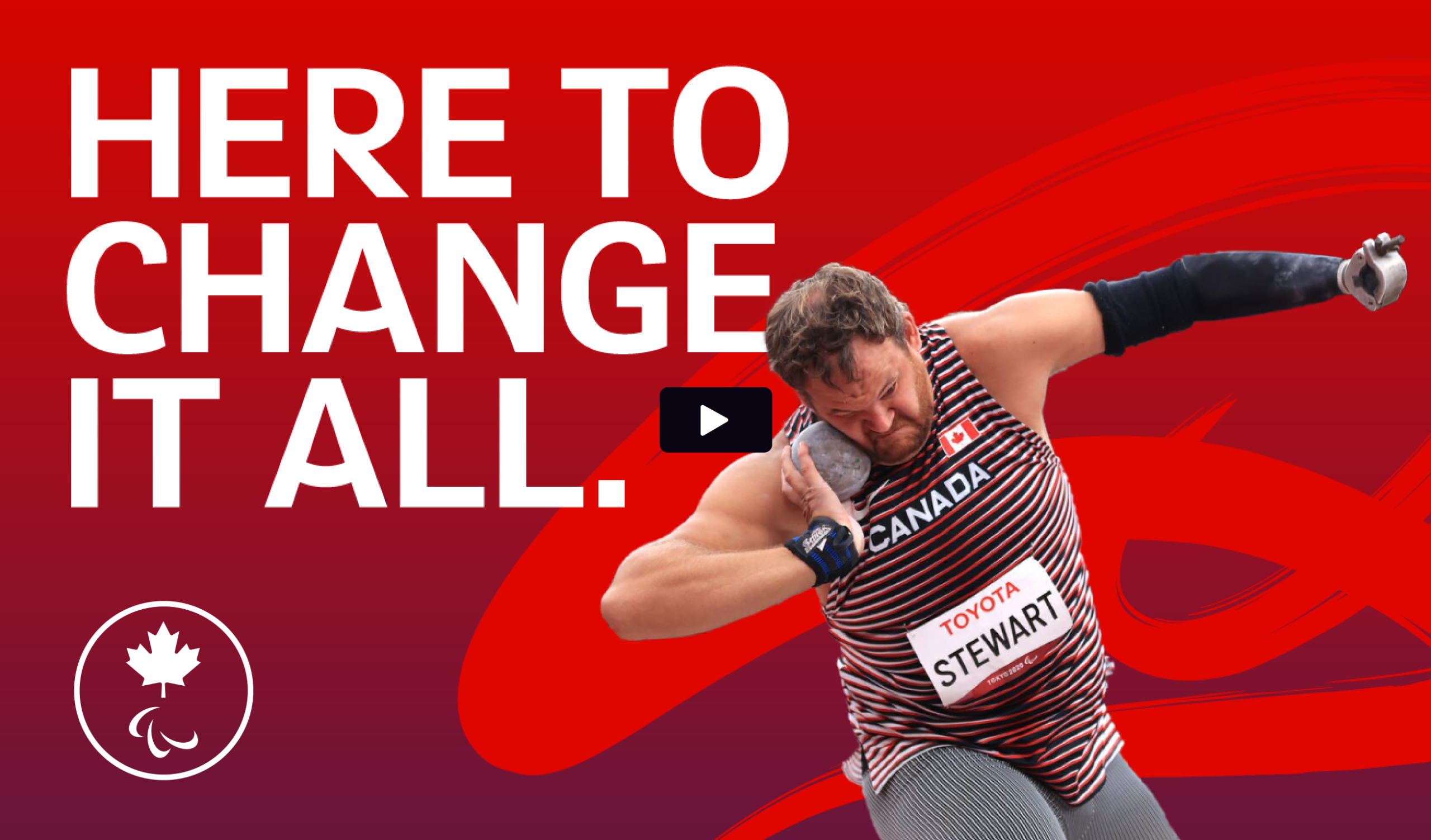
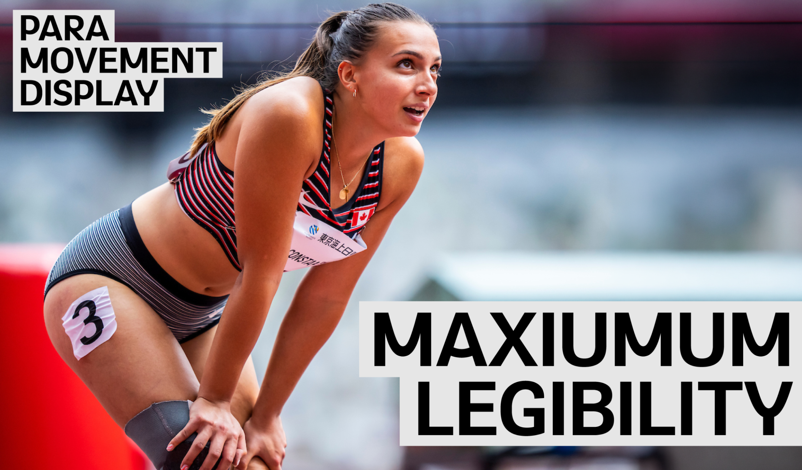
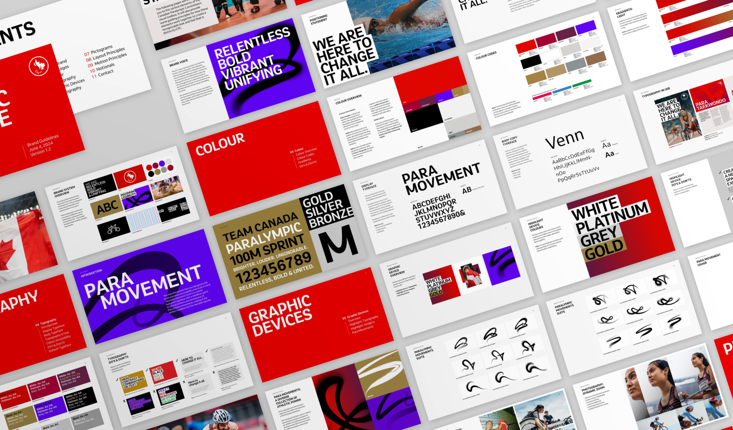
Accessibility guided every design decision. A high-contrast colour system improved visibility across digital, print, and environmental applications, while text framing devices enhanced readability and hierarchy. A custom-adapted display typeface, created in collaboration with Dalton Maag, captured the feeling of movement without compromising legibility.
To create a visual language rooted in sport itself, we studied and mapped real athlete movements from Paralympic competition. Those motion paths were transformed into a suite of graphic shapes used throughout the identity system — giving the brand a sense of authenticity, energy, and dynamism.
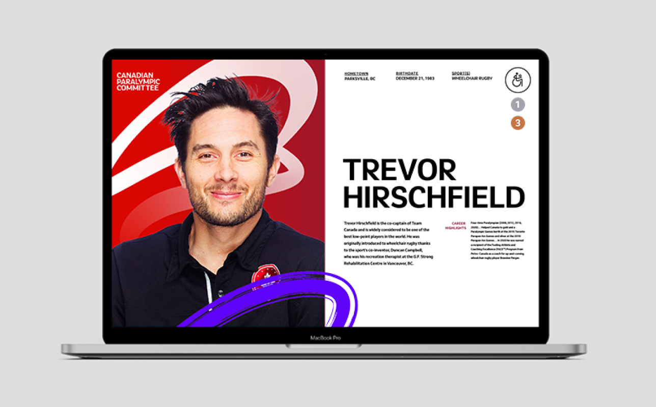
The result was a cohesive identity system designed to scale across campaigns, events, partnerships, merchandise, and digital touchpoints. It helped position the CPC as a progressive, inclusive organization while celebrating the power and greatness of Canada’s Paralympic athletes.
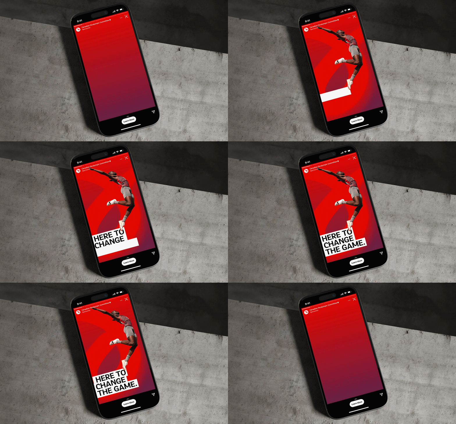
Animated gif of a phone ad
Created while working at WILL
Chief Creative Officer: Nick Richards
Copywriter: Danielle Haythorne
Associate Creative Director: Briony Crane
Designer: Jenn HIcks
Brand Team: Marjo Durand
Strategy: Nicola Poskitt
Producer: Brie Puffer
More projects
Want to create something together?
© 2026 Jenn Hicks. All rights reserved.